Not logged in. Log In or Register

20,000 Fathoms Under the Sea

The Massassi Temple » Levels/Mods » Jedi Knight Multiplayer Level » 20,000 Fathoms Under the Sea

Description

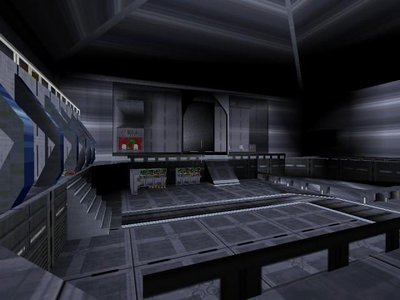
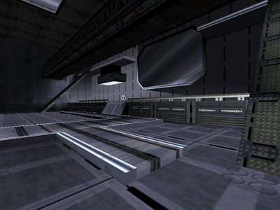
A medium-sized level set in the shadowy remains of a deep sea station. It is lighted fairly dark so opponents can hide in the shadows and capture their prey by surprise. This level was meant to be for pure deathmatch, nothing else.

Screenshots

screenshot 1 screenshot 2

Level Info:

Download:
File Size:
663.4 KiB
Date:
2000-11-29
Author:
Moonraker
Downloads:
2899

Ratings:

Score (0-10):
6
# of Ratings:
10
Rate:

User Comments:

Register for Commenting System or Log In

Posted by
Comment
RSG_ATOMICDOG
Posted: 2000-11-29 5:57 p.m.   Report Abuse
rrrriiiiiggghhhhttttt....nice level dude. good lighting. but i think i will stick with Deep MLP2
PEZ
Posted: 2000-11-29 6:01 p.m.   Report Abuse
Some of the mats used in the level caused cmp errors at a certain distance. There was one mat used on a chair that wasn't included in the gob so it just showed the default mat. Also when touching or jumping over the chairs you would often get stuck and have to kill yourself to get out. The author should have spent more time testing.
Sven Solo
Posted: 2000-11-30 7:29 a.m.   Report Abuse
....I'm speechless....
Jimanatore
Posted: 2000-11-30 9:36 p.m.   Report Abuse
The getting stuck on the chairs is annoying, framerate wasnt that good, and the water tube thing was a bit weird, Lots of potential though, just need a better plan next time.
puresith
Posted: 2000-12-03 2:44 p.m.   Report Abuse
this level looks cool. i think ill download it even though it has messed up chairs.
Dark_Brakiss
Posted: 2001-05-11 6:47 p.m.   Report Abuse
Good job. It would have been nicer or more exciting if you entered a room that filled with wateror pressed a button that broke some glass windows and filled a level with water. Just an idea...............
Chris
Posted: 2001-07-23 2:16 p.m.   Report Abuse
The idea for the level is alright i thought. However there is not much space for fighting and the framerate is bad on slower computers. You could make another level like this but bigger and remove some of the objects.
WhiteNight
Posted: 2001-11-20 4:20 p.m.   Report Abuse
Not very big at all, nothing really stand out.
Orus
Posted: 2002-01-15 6:11 a.m.   Report Abuse
very very nice !! good job
longphi3000
Posted: 2002-07-17 7:23 a.m.   Report Abuse
It is a pretty well designed level except the part where you get stuck on the chairs. Good job...
MentatMM
Posted: 2007-06-09 10:25 p.m.   Report Abuse
1/5.

Register for Commenting System


3D Preview developed by Stephan Reiter